原文
Tutorial on Document tab restyling(外部サイト)
訳文
Documentタブの再スタイリングのチュートリアル
Tutorial on Document tab restyling
初めに言っておくことは、このチュートリアルは、「はじめに」ではないことです。; これは、読者がこれを読む前に、非常によくAvalonDockのドッキングインターフェイスを構築する方法を知っている必要があることを示しています。 (詳細は、基礎チュートリアルに準拠しています。
本記事は、文書の内容の再スタイリングについてです。特に、文書タブ、それは、通常、含れている文書のタイトルを表示します。 そして、(バージョン1.2から)小さなロックされたアイコンは、基底クラスManagedContentのプロパティIsLockedに結合されます。
このサンプルでは、私たちは、それぞれのドキュメント・タブのドキュメント・タイトルのそばに、小さなプログレス・バーを追加することになります。 もちろん、あなたがタブに他に何かを追加したい場合、同じ方法で動作します。(すなわち、文書その他を閉じる小さな十字アイコンなど...)。
これが、最終的な結果です。:
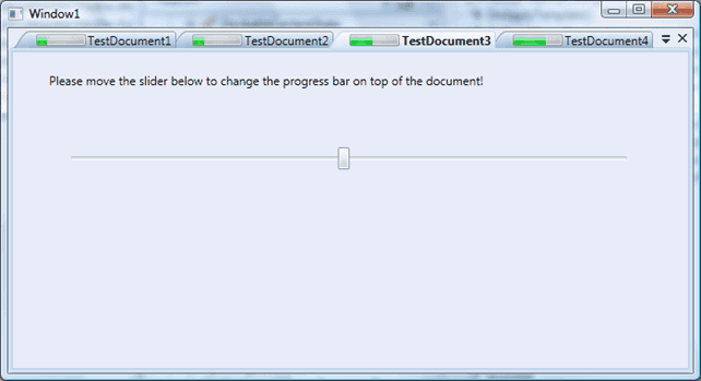
すべての最初に、Visual Studioで新しいWPFプロジェクトを作成します。AvalonDockアセンブリを参照します。 そして、その次に、最初のWindow1ファイルにDockingManagerコントロールを追加します。結果として得られるコードは、これのようなものになります。:
<Window x:Class="AvalonDockStyleTest.Window1"
    xmlns="http://schemas.microsoft.com/winfx/2006/xaml/presentation"
    xmlns:x="http://schemas.microsoft.com/winfx/2006/xaml"
    xmlns:local="clr-namespace:AvalonDockStyleTest"
    xmlns:ad="clr-namespace:AvalonDock;assembly=AvalonDock"
    Title="Window1" Height="321" Width="595">
    <Grid>
        <ad:DockingManager>
            <ad:DocumentPane>
            </ad:DocumentPane>
        </ad:DockingManager>
    </Grid>
</Window>
次に、私たちは、カスタム・ドキュメントを作成する必要があります。(クラスは、DocumentContentから派生しています。) それは、Progressプロパティを格納することになります。最も簡単な方法は、WPFのUserControlを作成することです。 私たちの場合は、CustomDocumentを呼び出しました。VSは、2つのファイルを作成することになります。: XAMLは、WPFインターフェースが含まれています。(CustomDocument.xaml) そして、コード・ビハインド・ファイル (CustomDocument.xaml.cs)(おそらく、私は、ここで、あまりにたくさん説明しました。:) )。 UserControlからDocumentContentに基底クラスを変更するために、xamlコードとソースコードを変更します。:
CustomDocument.xaml
<ad:DocumentContent x:Class="AvalonDockStyleTest.CustomDocument"
    xmlns="http://schemas.microsoft.com/winfx/2006/xaml/presentation"
    xmlns:x="http://schemas.microsoft.com/winfx/2006/xaml"
    xmlns:ad="clr-namespace:AvalonDock;assembly=AvalonDock"
    Height="300" Width="300">
    <Grid>
        <Slider Height="23" Margin="53,95,56,0" Name="slider1" VerticalAlignment="Top" Value="{Binding Path=Progress}" />
        <TextBlock Height="66" Margin="36,20,36,0" Name="textBlock1" VerticalAlignment="Top"
Text="Please move the slider below to change the progress bar on top of the document!" TextWrapping="Wrap" />
    </Grid>
</ad:DocumentContent>

CustomDocument.xaml.cs
    /// <summary>
    /// Interaction logic for CustomDocument.xaml
    /// </summary>
    public partial class CustomDocument : DocumentContent
    {
        public CustomDocument()
        {
            this.DataContext = this;
            InitializeComponent();
        }


        public int Progress
        {
            get { return (int)GetValue(ProgressProperty); }
            set { SetValue(ProgressProperty, value); }
        }

        // Using a DependencyProperty as the backing store for Progress.  This enables animation, styling, binding, etc...
        public static readonly DependencyProperty ProgressProperty =
            DependencyProperty.Register("Progress", typeof(int), typeof(CustomDocument), new FrameworkPropertyMetadata(3));
    }
見ての通り、私は、「Progress」と呼ばれる依存関係プロパティを追加しました。 それは、ドキュメントの進捗の値を持っています。このプロパティは、WPFの結合によってカスタム・スタイルに添付されることになります。 私たちは、私たちのCustomDocumentを作成するつもりです。同様に、XAMLからドキュメントに配置されたスライダーは、同じプロパティに結合されることに注意してください。 このように、ユーザーがスライダーを動かすと、Progressプロパティは、更新されることになり、タブのタイトルのそばに配置されるプログレス・バーに、同じ値が伝えられることになります。
次に、Window1に、いくつかのカスタム・ドキュメントを追加します。私たちが持っているDocumentPaneの子供たちは、上記のように作成されます。:
<Window x:Class="AvalonDockStyleTest.Window1"
    xmlns="http://schemas.microsoft.com/winfx/2006/xaml/presentation"
    xmlns:x="http://schemas.microsoft.com/winfx/2006/xaml"
    xmlns:local="clr-namespace:AvalonDockStyleTest"
    xmlns:ad="clr-namespace:AvalonDock;assembly=AvalonDock"
    Title="Window1" Height="321" Width="595">
    <Grid>
        <ad:DockingManager>
            <ad:DocumentPane>
                <local:CustomDocument Title="TestDocument1"/>
                <local:CustomDocument Title="TestDocument2"/>
                <local:CustomDocument Title="TestDocument3"/>
                <local:CustomDocument Title="TestDocument4"/>
            </ad:DocumentPane>
        </ad:DockingManager>
    </Grid>
</Window>
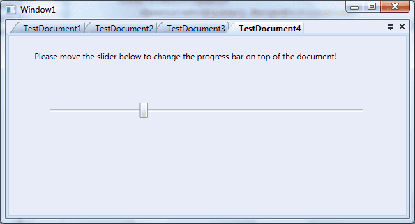
次に、プロジェクトを構築して、実行します。あなたは、このようなウィンドウを見ことになります。:
はい、次に、ドキュメント・タブのカスタム・スタイルを作成していきましょう。 Visual Studioを使用して、CustomStyles.xamlという名前の新しいResourceDictionaryを作成します。 そこで、私たちは、すべてのカスタム・スタイルを配置することになります。 私たちは、私たちのアプリケーションで使用することになります。 私たちは、同様に、それをどこかで参照する必要があります。 このサンプルでは、私は、アプリケーション・レベルでそれを利用可能とすることに決意しました。 それで、App.xamlコードを編集しました。:
App.xaml
<Application x:Class="AvalonDock.StyleTest.App"
    xmlns="http://schemas.microsoft.com/winfx/2006/xaml/presentation"
    xmlns:x="http://schemas.microsoft.com/winfx/2006/xaml"
    StartupUri="Window1.xaml">
    <Application.Resources>
        <ResourceDictionary>
            <ResourceDictionary.MergedDictionaries>
                <ResourceDictionary Source="CustomStyles.xaml" />
            </ResourceDictionary.MergedDictionaries>
        </ResourceDictionary>
    </Application.Resources>
</Application>
AvalonDockコントロールのためのスタイルを作成するのは、とても扱いにくいです。 私は、プレコンパイルド・スタイルから開始することを、あなたに提案します。 AvalonDockのソースコードを実際に開けて、ResourcesとThemesフォルダを調べます。 そこで、あなたは、AvalonDockに存在する特別なテーマに従い、 それぞれのコントロールの多くのスタイルを見つけ出すことができます。
私たちの目的のために、私たちは、DocumentPaneコントロールの基本となるスタイルから開始することになります。(展望テーマ)。 それで、DocumenttabItemStyleと呼ばれるスタイルや、 単純に、あなたのCustomStyles.xaml内の以下のcopy&pasteと一緒に、 DocumentPaneに作成される部分に位置しているaero.normalcolor.xamlを開きます。:
CustomStyles.xaml
<ResourceDictionary.MergedDictionaries>
<ResourceDictionary
Source="/AvalonDock;component/themes/generic.xaml"/>
<!--Aero colors-->
<ResourceDictionary
Source="/AvalonDock;component/themes/aero.normalcolor.brushes.xaml"/>
</ResourceDictionary.MergedDictionaries>
<Style x:Key="CustomDocumentTabItemStyle"
TargetType="{x:Type local:CustomDocument}">
<Setter Property="Background"
Value="Transparent"/>
<Setter Property="Template">
<Setter.Value>
<ControlTemplate TargetType="{x:Type local:CustomDocument}">
<Border
x:Name="PART_DragArea"
BorderBrush=
"{StaticResource ManagedContentTabControlNormalBorderBrush}"
Margin="-10,0,0,0"
SnapsToDevicePixels="True"
ContextMenu=
"{DynamicResource {ComponentResourceKey {x:Type ad:DockingManager}, {x:Static ad:ContextMenuElement.DocumentPane}}}"
>
<Grid Margin="0,0,0,0" >
<Grid.ColumnDefinitions>
<ColumnDefinition Width="20"/>
<ColumnDefinition Width="Auto"/>
</Grid.ColumnDefinitions>
<Path Data="M 20,0.5 Q 16,0.5 10,10 Q 5,19.5 0,19.5 L 20,19.5"
x:Name="tabItemIntPathBackground"
Fill=
"{DynamicResource {ComponentResourceKey {x:Type ad:DockingManager}, {x:Static ad:AvalonDockBrushes.DocumentHeaderBackground}}}"/>
<Path
x:Name="tabItemIntPathBorder"
Stroke=
"{StaticResource ManagedContentTabControlNormalBorderBrush}"
Data=
"M 20,0.5 Q 16,0.5 10,10 Q 5,19.5 0, 19.5"
/>
<Border
x:Name="tabItemIntBorder"
Grid.Column="1"
BorderThickness="0,1,1,0"
Margin="-0.5,0,0,0"
CornerRadius="0,3,0,0"
BorderBrush=
"{StaticResource ManagedContentTabControlNormalBorderBrush}"
Background=
"{DynamicResource {ComponentResourceKey {x:Type ad:DockingManager}, {x:Static ad:AvalonDockBrushes.DocumentHeaderBackground}}}"
>
<StackPanel Orientation="Horizontal"
Margin="5,0,4,0">
<ProgressBar Width="50"
Margin="2" Minimum="1" Maximum="10"
Value="{Binding Path=Progress, RelativeSource={RelativeSource TemplatedParent}}"></ProgressBar>
<TextBlock
x:Name="tabItemTitle"
TextTrimming="CharacterEllipsis"
TextWrapping="NoWrap"
Text="{TemplateBinding Title}"
Foreground=
"{DynamicResource {ComponentResourceKey {x:Type ad:DockingManager}, {x:Static ad:AvalonDockBrushes.DocumentHeaderForeground}}}"/>
<ad:AlignedImage
x:Name="PART_LockedIcon" Margin="2,0,0,0" Visibility="Collapsed" VerticalAlignment="Center" HorizontalAlignment="Center">
<Image
Source="/AvalonDock;component/resources/Images/Locked.png" Width="6" Height="8" Stretch="Uniform"/>
</ad:AlignedImage>
</StackPanel>
</Border>
</Grid>
</Border>
<ControlTemplate.Triggers>
<Trigger Property="Selector.IsSelected" Value="True">
<Setter Property="Background"
TargetName="tabItemIntBorder"
Value=
"{DynamicResource {ComponentResourceKey {x:Type ad:DockingManager}, {x:Static ad:AvalonDockBrushes.DocumentHeaderBackgroundSelected}}}"
/>
<Setter Property="Fill"
TargetName="tabItemIntPathBackground"
Value=
"{DynamicResource {ComponentResourceKey {x:Type ad:DockingManager}, {x:Static ad:AvalonDockBrushes.DocumentHeaderBackgroundSelected}}}"
/>
<Setter Property="BorderBrush" TargetName="tabItemIntBorder"
Value=
"{DynamicResource {ComponentResourceKey {x:Type ad:DockingManager}, {x:Static ad:AvalonDockBrushes.DocumentHeaderBorder}}}"/>
<Setter Property="Stroke" TargetName="tabItemIntPathBorder"
Value=
"{DynamicResource {ComponentResourceKey {x:Type ad:DockingManager}, {x:Static ad:AvalonDockBrushes.DocumentHeaderBorder}}}"/>
<!--<Setter Property="Panel.ZIndex" Value="1"/> DOES NOT WORK! I DON'T KNOW WHY!!???-->
</Trigger>
<DataTrigger
Binding="{Binding Path=IsActiveDocument, RelativeSource={RelativeSource Self}}" Value="True">
<Setter
Property="TextBlock.FontWeight" TargetName="tabItemTitle" Value="Bold"/>
</DataTrigger>
<MultiTrigger>
<MultiTrigger.Conditions>
<Condition Property="IsMouseOver" SourceName="tabItemIntBorder" Value="True"/>
<Condition Property="Selector.IsSelected" Value="False"/>
</MultiTrigger.Conditions>
<Setter Property="Background"
TargetName="tabItemIntBorder"
Value=
"{DynamicResource {ComponentResourceKey {x:Type ad:DockingManager}, {x:Static ad:AvalonDockBrushes.DocumentHeaderBackgroundMouseOver}}}"
/>
<Setter Property="Fill"
TargetName="tabItemIntPathBackground"
Value=
"{DynamicResource {ComponentResourceKey {x:Type ad:DockingManager}, {x:Static ad:AvalonDockBrushes.DocumentHeaderBackgroundMouseOver}}}"
/>
</MultiTrigger>
<DataTrigger
Binding="{Binding Path=IsLocked, RelativeSource={RelativeSource Self}}" Value="True">
<Setter Property="Visibility"
Value="Visible" TargetName="PART_LockedIcon"/>
</DataTrigger>
</ControlTemplate.Triggers>
</ControlTemplate>
</Setter.Value>
</Setter>
</Style>
<!--DocumentPane-->
<Style TargetType="{x:Type ad:DocumentPane}">
<Setter Property="Background"
Value="{DynamicResource {ComponentResourceKey {x:Type ad:DockingManager}, {x:Static ad:AvalonDockBrushes.DefaultBackgroundBrush}}}"/>
<Setter Property="FocusVisualStyle" Value="{x:Null}"/>
<Setter Property="Template">
<Setter.Value>
<ControlTemplate TargetType="{x:Type ad:DocumentPane}" >
<ControlTemplate.Resources>
<ContextMenu x:Key="DocumentsListMenu" StaysOpen="True" >
<!--ItemTemplate="{StaticResource ManagedContentHeaderDataTemplate}"-->
<ContextMenu.ItemContainerStyle>
<Style TargetType="{x:Type MenuItem}">
<Setter Property="CommandParameter"
Value="{Binding RelativeSource={x:Static RelativeSource.Self}, Path=Header}"/>
<Setter Property="Command">
<Setter.Value>
<RoutedCommand />
</Setter.Value>
</Setter>
<Setter Property="Template">
<Setter.Value>
<ControlTemplate TargetType="MenuItem">
<Border x:Name="intBorder" BorderThickness="1"
Background="{TemplateBinding Background}" CornerRadius="2">
<Grid>
<Grid.ColumnDefinitions>
<ColumnDefinition Width="Auto" MinWidth="24"/>
<ColumnDefinition Width="*"/>
</Grid.ColumnDefinitions>
<ContentPresenter x:Name="Icon" Margin="2"
Content="{Binding Path=Icon}" Grid.Column="0" VerticalAlignment="Center"/>
<TextBlock x:Name="intMenuTitle" Margin="5,2,20,2"
Text="{Binding Path=Title}" Grid.Column="1" VerticalAlignment="Center"/>
</Grid>
</Border>
<ControlTemplate.Triggers>
<Trigger Property="IsMouseOver" Value="true">
<Setter Property="Background" TargetName="intBorder">
<Setter.Value>
<SolidColorBrush
Color="{DynamicResource {x:Static SystemColors.ActiveCaptionColorKey}}" Opacity="0.3"/>
</Setter.Value>
</Setter>
<Setter Property="BorderBrush" TargetName="intBorder"
Value="{DynamicResource {x:Static SystemColors.ActiveCaptionBrushKey}}"/>
</Trigger>
<DataTrigger Binding="{Binding Path=IsActiveDocument}" Value="True">
<Setter Property="FontWeight" Value="Bold" TargetName="intMenuTitle"/>
</DataTrigger>
<!--<Trigger Property="Icon"
Value="{x:Null}">
<Setter TargetName="Icon"
Property="Visibility"
Value="Collapsed"/>
</Trigger>-->
</ControlTemplate.Triggers>
</ControlTemplate>
</Setter.Value>
</Setter>
</Style>
</ContextMenu.ItemContainerStyle>
</ContextMenu>
</ControlTemplate.Resources>
<Border
Focusable="False"
Background="{TemplateBinding Background}"
>
<Grid>
<Grid.RowDefinitions>
<RowDefinition Height="20"/>
<RowDefinition Height="*"/>
</Grid.RowDefinitions>
<Grid Grid.Row="1" Margin="0,-1,0,0">
<Border
BorderThickness="5"
BorderBrush=
"{DynamicResource {ComponentResourceKey {x:Type ad:DockingManager}, {x:Static ad:AvalonDockBrushes.DocumentHeaderBorder}}}"
CornerRadius="3"
Focusable="False">
</Border>
<Border BorderThickness="2"
BorderBrush=
"{DynamicResource {ComponentResourceKey {x:Type ad:DockingManager}, {x:Static ad:AvalonDockBrushes.DocumentHeaderBorder2}}}"
CornerRadius="3"
Margin="1"
Focusable="False"
Background=
"{Binding RelativeSource={RelativeSource TemplatedParent}, Path=SelectedItem.Background}"
>
<ContentPresenter
Content=
"{Binding RelativeSource={RelativeSource TemplatedParent}, Path=SelectedItem.Content}"
Margin="2"
KeyboardNavigation.TabNavigation="Local"
KeyboardNavigation.DirectionalNavigation="Contained"
KeyboardNavigation.TabIndex="1"
/>
</Border>
</Grid>
<Border x:Name="PART_Header"
Grid.Row="0"
Focusable="False"
BorderThickness="1,1,1,0">
<DockPanel LastChildFill="True">
<Button DockPanel.Dock="Right" Width="15" Height="15" Margin="2,0,2,0"
Style="{StaticResource PaneHeaderCommandStyle}" Command="ApplicationCommands.Close">
<Image
Source="/AvalonDock;component/resources/Images/PinClose.png" Width="13" Height="13" Stretch="None"/>
</Button>
<Button
x:Name="PART_ShowContextMenuButton" DockPanel.Dock="Right" Width="15" Height="15"
Style="{StaticResource PaneHeaderCommandStyle}">
<Button.Command>
<RoutedCommand />
</Button.Command>
<Image x:Name="ShowContextMenuIcon"
Source="/AvalonDock;component/resources/Images/PinMenu.png" Width="13" Height="13" Stretch="None"/>
</Button>
<ad:DocumentTabPanel
x:Name="paneTabsPanel"
Panel.ZIndex ="1"
KeyboardNavigation.TabIndex="2"
IsItemsHost="True"
Margin="10,2,0,0"
TabItemStyle="{StaticResource CustomDocumentTabItemStyle}" />
</DockPanel>
</Border>
</Grid>
</Border>
<ControlTemplate.Triggers>
<Trigger Property="HasItems" Value="False">
<Setter Property="Visibility" Value="Hidden"/>
</Trigger>
<DataTrigger
Binding="{Binding Path=IsMainDocumentPane, RelativeSource={RelativeSource Self}}" Value="True">
<Setter Property="Source"
Value="/AvalonDock;component/resources/Images\PinDocMenu.png" TargetName="ShowContextMenuIcon"/>
</DataTrigger>
<EventTrigger RoutedEvent="Window.Loaded">
<BeginStoryboard>
<Storyboard>
<DoubleAnimation
Storyboard.TargetProperty="Opacity"
From="0" To="1" Duration="0:0:0.200" />
</Storyboard>
</BeginStoryboard>
</EventTrigger>
</ControlTemplate.Triggers>
</ControlTemplate>
</Setter.Value>
</Setter>
</Style>
わたしたちの場合では、私たちは、単に、1つのコントロールのスタイルを変更する必要があります。:DocumentPaneクラス。 あなたが見る上のスタイルは、単純なドキュメントのコンテナのDocumentPaneを見ることができます。 それは、毎回、ただ1つのドキュメントの内容を表示します。 すべてのドキュメントは、上部のタブで、それぞれ表示されます。(ちょうど、TabControlのような。)。 選択されたドキュメントは、強調表示されたタブを持っています。 タブは、「DocumentTabItemStyle」と呼ばれるカスタム・スタイルでスタイルを整えられています。
次に、ad:ManagedContentからローカルものまで、ターゲット形式を変更しましょう。:CustomDocument(私たちのカスタムドキュメントクラス) そして、実際に、より明らかです、タブ項目スタイルの名前を「DocumentTabItemStyle」から「CustomDocumentTabItemStyle」に変更します。 同様に、あなたは、したがって、すべての参照の名前をそれらのファイルの名前へ変更します。
次の手順は、タブの上にプログレス・バーを追加することです。: これは、この場合、とても簡単です。CustomDocumentTabItemStyleにスタック・パネル・コントロールを配置します。 ドキュメントのタイトルとロックしたアイコンを積み重ねます。 そこでは、実際に、TextBlockをタイトルに表示する前に、プログレス・バーを追加し、 それにテンプレート化した親のProgressプロパティを結合します。(CustomDocument型のオブジェクト)。
この部分は、影響を受けました。:
<StackPanel Orientation="Horizontal"
            Margin="5,0,4,0">
    <ProgressBar Width="50" Margin="2" Minimum="1" Maximum="10"
Value="{Binding Path=Progress, RelativeSource={RelativeSource TemplatedParent}}"></ProgressBar>
        <TextBlock
            x:Name="tabItemTitle"
            TextTrimming="CharacterEllipsis"
            TextWrapping="NoWrap"
            Text="{TemplateBinding Title}"
            Foreground=
"{DynamicResource {ComponentResourceKey {x:Type ad:DockingManager}, {x:Static ad:AvalonDockBrushes.DocumentHeaderForeground}}}"/>
    <ad:AlignedImage x:Name="PART_LockedIcon" Margin="2,0,0,0"
Visibility="Collapsed" VerticalAlignment="Center" HorizontalAlignment="Center">
        <Image Source="/AvalonDock;component/resources/Images/Locked.png" Width="6" Height="8" Stretch="Uniform"/>
    </ad:AlignedImage>
</StackPanel>
プロジェクトを構築して、実行します。あなたは、スライダーを移動し、それぞれのドキュメント・タブのプログレス・バーがその値に従って変更されることを見ることができるはずです。
(何人かの人々は、なぜ、私が記述された記事の代わりに、いくつかのビデオ・チュートリアルを公開していないかについて、私に尋ねました。 私は、完全に、ビデオ・チュートリアルの重要性を知っています。現在の問題は、私は、いくつかの画面録画プログラムのフリーのライセンスを必要としています。 そして、同様に、私の英会話が、私のオフィスの外で安定した状態である確信がありません。:)。いずれにしろ、私は、ここで作業しています!)
コードは、ここです。:AvalonDock.StyleTest.rar(外部サイト)
午後9時20分の2010年6月22日にadospaceにより、最後に編集された、version 16です。